Issue 6: Color
The Delightfulness Project is a monthly newsletter exploring what makes products delightful. For future updates, subscribe here.
Hello readers 👋
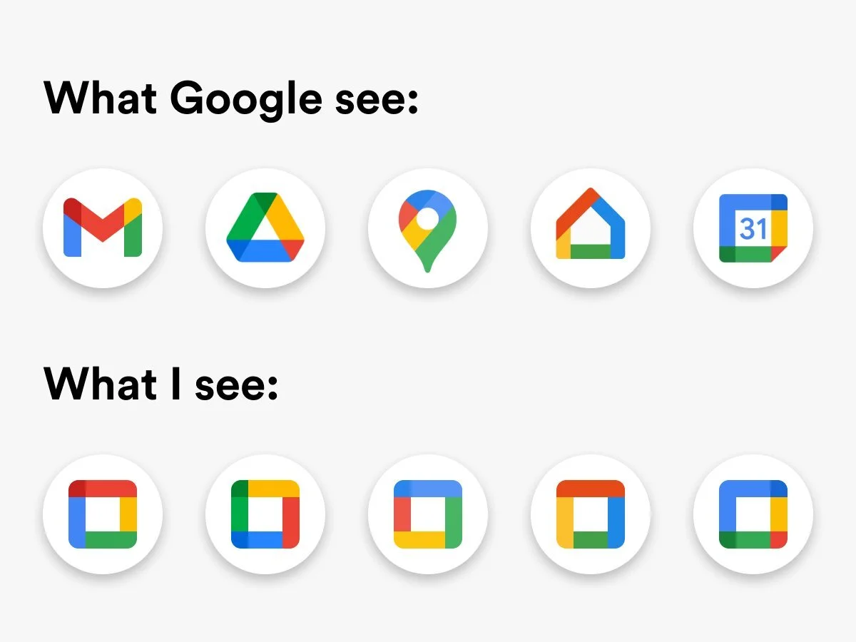
A few weeks ago, Google released a set of new app icons, meant to tie together their digital products. You know them: Google Drive, Google Sheets, Google Docs, Google Maps, etc, etc.
From a branding perspective, it was a logical move— rather than having each app represented by a different color, why not bring them together?
Unfortunately... most people disagreed. 👀
Case in point: the post below that started making its rounds on Reddit shortly after the announcement.
⤷ Source: Reddit
Oops.
This incident got me thinking about color and how it’s used in products and design. Why does color work so well in some products and not in others?
To help us understand, let's start with the bad.
A Terrible Study in Color 😱
In 2015, Sherwin-Williams, the American paint company, came out with an absolutely horrendous logo redesign (below) that— despite the horrifying and controversial public backlash— remains the company's logo to this very day! The main issue? Color.

⤷ Source: Sherwin-Williams
Why was this logo so bad?
In a listicle of "15 Business Logo Fails" (where this Sherwin Williams logo ranked #1), the author says it best:
““The paint company has already been met with controversy for contributing to both lead poisoning and contamination, and their logo—which depicts the earth being coated in unnatural, blood-red paint—conjures up images of the poisoning or polluting of the planet.”
”
To this day, this logo still reminds me more of a bloodthirsty world conqueror than a paint company, but honestly, with all the controversies that Sherwin-Williams has been involved with, maybe the logo is sneakily intentional? 👀
But… I digress. Back to color!
We just looked at a terrible example of color in branding. But how does color affect a product’s usability? 🤔
Among Us is an online multiplayer game that has swept the world. If you’ve never tried it, here's quick overview: you and other players are crew mates on a large spaceship, with many tasks to complete. Unfortunately, one of you is an imposter (gasp!), whose goal is to sabotage the ship and kill everyone else! Only through careful group deduction can you unmask the imposter.
Among Us uses a notoriously simple interface, where colors are the main way to distinguish players. Currently, players can choose between 12 different colors, but unfortunately, these colors are not colorblind friendly. About 300 million people around the world live with some type of colorblindness. Depending on what type of color blindness you might have, anywhere from 2 to 7 of the color could be indistinguishable, making it very hard to tell players apart.
Here’s an example of how players might look like to someone with protanopia, a form of colorblindness, where red and green can’t be seen.

⤷ Source: Umma Desai, from "The UX of Among Us"
In a game based on observing others to survive, this design issue is huge burden for colorblind players. But wait, there's more!
One of the tasks in the game, "Fix Wiring", asks players to match broken wires from one side to another. Unfortunately, the wires are only distinguishable by color, a task that was completely impossible for players with monochromacy, another type of colorblindness.
Below is an example of what the wiring panel looks like to players with full color vision (left) and what the panel might look like to players with monochromacy (right).

⤷ Source: BaconShadow, "Colorblind fix wiring but you're colorblind too"
As you can see, the left side shows colors in full, while on the right side, the differently-colored wires are indistinguishable.
Luckily, these issues won't be here for long. On November 20 (just days ago), Among Us released a recent patch, adding symbols to identify each colored wire. Their team has confirmed that additional colorblind support will be added in future updates.
So… Why Color? 🎨
The truth is, we humans are incredibly visual creatures. "More than 50 percent of the cortex, the surface of the brain, is devoted to processing visual information", says David Williams, a professor of medical optics at University of Rochester.
Within this visual realm, color plays a crucial role, helping us identify danger, influence our mood, and even shift our body's natural cicadian rhythm.
In design, color can be used to improve usability, increase conversion rates, and save device energy.
In this issue, I hope to help you learn how to think of color as your own tool for making products more delightful and effective. 💖
In This Issue

How to incorporate color into your products enhance user experience.

Stories from inspiring creative leaders— who just happen to be color blind.

Content & interactive tools to kick start your personal learning journey.
Animations courtesy of Amila Roshan, Jerfeson Guerreiro, Jeevan Prakash
Color in Products
Diving into the power of color in product design, and how to use it.

⤷ Color animation, courtesy of Kanrad
When we talk about color in products, we usually mean a color scheme, or a group of colors that come together in a unified way.
According to Google Material Design principles, a color scheme consists of 3 groups of colors:
A primary color
The color that is used most frequently in a color scheme. This includes at least two variations: a darker version and a lighter one.
A secondary color
Usually, this is selected by either choosing a complementary or analogous color. Monochrome color schemes will not have a secondary color. This will also include dark and light variants.
Additional colors
These are colors applied to things like errors, backgrounds, type, and icons.
Altogether, a color scheme can look like this in an app (below). ⤵️

⤷ A UI example from Vandelay Design
In the above example, blue is the clear primary color, with sky blue as a lighter variant. Yellow is selected as a secondary color, with white used for button and text. You can also see a darker blue used for icons and labels for each field in the signup form.
In the above example, most people might think of these colors as an extension of branding. However, there’s purpose and function to them too.
To better understand this, let’s dive into several non-branding functions of color in products.
4 (Non-Branding) Usages of Color
Color can be used for many different purposes, but when it comes to usability, the main usages are: hierarchy, legibility, emphasis, and consistency.

⤷ Animation courtesy of Goyo
1. Hierarchy
Color draws our eyes to specific parts of the page. By pairing different colors, we can either create contrast or similarity. In this way, colors can be used to imply relationships between multiple elements of a design, or distinguish one element from others.


Above are two examples from Google Material Design that show color hierarchy in action. On the left, a mock travel app applies purple to the backdrop, while white is used in the results card to create contrast and the illusion of one surface placed above the other.
On the right, a magazine app uses color to distinguish different sections of an app. Yellow is for the first step, where people select favorite topics. Blue is used in the results page, and pink is used as a highlight for the individual article.

⤷ Animation courtesy of Spencer Lalonde
2. Legibility
Since color creates contrast, it can also be used to make text, images, or icons more visible and easy-to-read.
In the example below, color is used to add a backdrop to the text, making it easier to read, especially since the text is layered above an image.

⤷ A UI example, courtesy of Google Material Design

⤷ Animation courtesy of Chethan
3. Emphasis
When you need to highlight a specific action or change that's occurred in your product, changing its color draws attention. You can also limit the use of color within a design to make a specific part really stand out.

⤷ From Owl, an education app

⤷ From Fortnightly, a news app
Above are two examples that show how color is used for emphasis.
On the left, Owl, an education app, uses a bright yellow as its primary color for the background of the app. Pink is used as a secondary color to indicate that an action or change has taken place (the user selecting a topic, in this case).
On the right, Fortnightly, a news app, uses the absence of color to emphasize content. The color scheme consists of a white background, black text, and a light gray top bar. As a result, your eyes are drawn to the full-color photo at the top of the article.

⤷ Animation courtesy of Manoj Kumar
4. Consistency
To help guide your users, color should always be used in the same way throughout any digital product. A color used for interactive elements, for example, shouldn’t be used for any non-interactive elements, or it will confuse people.
In the following two examples from Crane, a travel app, ask yourself: which design has a more prominent error message?

🤔
Did you guess the second design? If so, you’re right!
Since red is already used to indicate interactive elements, such as the filter and checkboxes, using orange for the error message creates more contrast. This means that people are more likely to notice it compared to the red error message in the first design.
Self Check ✅
To apply what you've just learned, let's go back to Google's icon refresh, shown below.
How do these icons perform against the 4 principles we just learned? Do they support a clear hierarchy, make each app more legible, create emphasis and establish consistency?

⤷ Image courtesy of Android Police
Answer:
This group of icons passes for consistency, and you might be able to argue that they imply that all of the apps sit at the same level (hierarchy). Unfortunately, they fail in legibility and emphasis. At first glance, they look too similar and would likely require labels to help people tell them apart. This means that in situations when people are most likely to use these icons (such as when they’re selecting an app from their phone), these colors actually reduce usability!
Try it yourself!
You can try this same exercise on your own for any digital product. Simply:
Open any digital app, website, or design.
Pick a page or section with some color.
Ask yourself. Does the use of color help or hurt in the following areas?
Hierarchy: Establishes a clear relationship between elements, either creating contrast or grouping similarities.
Legibility: Allows text, icons, and other elements to be more clearly distinguished and readable.
Emphasis: Easily draws people’s attention to the most important element in the group.
Consistency: The same color is used for interactive elements. A different color is used for non-interactive elements.
If it's a yes across all four, then you're good to go! And if not, then you know exactly which areas to improve. 🎉
Stories from Colorblind Creatives
Stories and projects, as shared by leaders in the creative world. 💞
While color is an incredibly powerful tool for influencing behavior and enhancing products, it can also be excluding when it's not used thoughtfully.
About 300 million people around the world see with some degree of color impairment, and that very much includes people in the creative world. Rather than me telling their stories for them, below I've highlighted a few stories from leaders in the creative world, who also just happen to see the world a bit differently.
"The Colorblind Designer", by Pablo Stanley
Pablo Stanley is a well-known voice in the design world, who is passionate about using design to unlock people's creativity. Previously a designer at Lyft and Invision, as well as co-founder of Carbon Health, Pablo Stanley recently launched Blush, a beautiful Figma/Sketch plugin that allows people access to beautiful illustrations at the touch of a button.
In a recent post on his blog, "The Design Team", Pablo discusses his experience as a colorblind designer in the form of a comic and in words, and shares some of his favorite inclusive tools for designing with color:
““Whenever I have to tell people that I’m colorblind, it sparks their curiosity, especially since I’m a designer. They are baffled by the idea of someone that can make things look pretty but can’t see color.”
”
"Confessions of a Designer/Developer", by Casey Baggz
Casey Baggz is a person of many hats, from technical product owner to lead front-end engineer to lead designer. Previously part of engineering teams at Bestow and Pattyrn, Casey now works at Pluralsight.
In a detailed and touching post on Medium, "Confessions of a Designer/Developer: Color-Blindness & How I overcame the Odds", Casey shares some personal stories growing up from childhood to adulthood, when he finally realized that he was colorblind. He also includes examples of digital and non-digital products he likes and dislikes.
From Casey’s post:
““I was recently listening to one of my favorite podcasts ‘Stuff You Should Know’ and they released an episode on color-blindness (CB) which was very educating and it made me realize — ‘I haven’t really talked about this to anyone in the industry…’ Why is that? Was I afraid, embarrassed maybe? Was I scared that I would lose the one thing I loved doing (creating products that help make peoples lives easier)?”
”
"Ishihara", by Yoav Brill
If you've ever briefly wondered if you were colorblind (I have), you've probably seen the Ishihara test (below).

⤷ Examples of Ishihara tests, courtesy of Web Eye Clinic
Created by Shinobu Ishihara, a professor at the University of Tokyo, in 1917, it was one of the first color tests of its type to successfully detect red-green color blindness.
Yoav Brill, now an Israeli journalist, producer, and part-time DJ, originally studied animation at the Bezalel Academy of Arts and Design in Jerusalem, Israel. For his graduation film, Yoav created a beautiful animation, inspired by the visual beauty of Ishihara tests, to share his own story of realizing that he is colorblind.
Curious to learn more? 🔎
If you enjoyed learning about stories from this community, then you'll also love "We Are Colorblind", a site dedicated to sharing stories, information, resources, and services related to serving the colorblind community online.
Learning & Inspiration
All primed up on onboarding? Here are some additional resources to continue your learning journey.

For people that love to play,
Khroma might be my favorite webtool I've found to date! Beautiful and deceptively simple, Khroma uses AI to learn which colors you like, and creates limitless palettes for you to discover, search, and save. I'm absolutely delighted by the palettes it's created for me so far, and so incredibly inspired to get designing!

For people who love psychology,
Color Meanings by Canva is a fun, interactive tool that allows you to look up different colors and learn about their history, meaning, and advice on usage. A sweet and simple way to get inspired by color.

For people newer to color,
Happy Hues, is a color inspiration site created by Mackenzie Child. With one click, you can try out curated color palettes to see the impact of different colors. HEX codes are provided for each element (awesome for both designers and front-end devs) and the coolest part? The entire site was built without a single line of code.

For people interested in colorblind resources,
We Are Colorblind is one of the best educational sites I've seen, dedicated to sharing stories, information, and resources about the colorblind community. They also provide colorblind audits and consulting.

For people who want to learn (even) more about color,
"The Underestimated Power of Color in Mobile App Design" digs into the basics of color theory, including different types of color schemes, contrast ratios, and a few more colorblind design tools.
A good primer for anyone looking to learn about or revisit color fundamentals.
So what? ⤵️
Color is something that we often take for granted. It's very clearly part of the world around us (especially in design), but we rarely take the time to think about it as an intentional tool for communication.
Whether we want to or not, color provokes visceral reactions in people. Like all types of visuals, color conveys information and meaning, from emphasizing hierarchy between objects to calling attention to parts of an app that need us most.
Used poorly, color can promote disgust, confusion, and even depression. But when applied well, it is clarifying, engaging, and inspiring. Though many of us may hope that our designs and products fall into the latter group, we often design exclusively for full-color viewers, excluding a 300-million-strong community around the world.
Today, I challenge you to think about color more critically. Take a second look at the use of color in your favorite products! Ask yourself:
Why is this color here? What is its purpose?
Who is it serving or not serving?
What information is it highlighting or diminishing?
As a final though, I hope that this newsletter leaves you with the tools and information to dive more confidently into the world of color. Because anytime products are driven by visuals, color is an essential ingredient of product delight. 💖

Woohoo, you made it to the end! 🥳 What’d you think of this issue?
If you liked it, please share & subscribe 💞
Know other product folks, designers, or tech lovers that might enjoy this month’s topic? Send them this issue or share it on Twitter.
And if you’d like to be reminded of upcoming issues, subscribe to get new issues straight to your inbox.
About the Writer
Lucy is a product manager, design nerd, and occasional blanket burrito. When not putting together newsletters, you can find her nose deep in a book or building apps for social impact.
If you’re curious about digital products, conversational design, or impactful technology, let’s connect on Twitter or email!