Issue 5: Onboarding
The Delightfulness Project is a monthly newsletter exploring what makes products delightful. For future updates, subscribe here.
Hi, readers! ✌️
Is it me or is everyone launching products these days?

⤷ Buzz has got it right— apps are everywhere these days!
In August alone, Statista reported 📈 31,800 new apps released through the Apple App store. It made me wonder- how many of those apps are actually effective at keeping people around? 🤔
According to Andrew Chen, a partner at Andreesen-Horowitz, the average app loses 77% of its daily active users 😱 within the first 3 days after installing. In comparison, the top 10 most popular apps lose less than 30% of their daily active users in that same period.

⤷ Retention curves for Android apps, courtesy of Andrew Chen
So what are these top app makers doing that we're missing? 🔎
The answer: onboarding. When most users try your product for the first time, chances are, they need a little guidance. Poor onboarding means that your user must spend more time figuring out where things are and how to use them. Good onboarding makes products feel simple, allowing users to rapidly get to that critical “aha!” moment.
In this issue, we'll be digging into user onboarding and how to help your users find value within the first 3 days of usage.
Let's go! 😎
In This Issue

A short & snappy definition of product onboarding and why it matters.

How to drastically improve your user onboarding experience.

Articles & resources to become an onboarding expert.
Animations courtesy of Julie Smith Schneider
What is Onboarding?
Understanding product onboarding and why it matters.
⤷ Ship animation courtesy of Alexandra B
The word onboarding is said to have originated in the 1970s, although it started becoming popular in business jargon in the last decade. It's inspired by novice sailors learning to get comfortable on board a ship! 🛳️
Similarly, user onboarding describes the process of helping your users get comfortable with your product. Usually this step starts right after users download 📥, purchase 💰, or open your app 📱 for the first time. It ends when your user finds value in your product, understands what it's about, and is motivated to keep using it. 💪
Designing a thoughtful user onboarding experience is critical because it helps your users master your product faster than they would on their own. This means users can focus on using your product instead of struggling to understand it, resulting in higher satisfaction 💖 and lower churn. 📉
So how do we improve user onboarding?
4 Steps for Improving Your User Onboarding
How to make onboarding more effective, relevant, and engaging. 💞

⤷ Animation courtesy of Arianna Cristiano & Laurentiu Lunic
One of the most common onboarding patterns I see are static swipe-throughs. ⚠️ Avoid these at all costs! ⚠️ All they do is block users from getting into the product. Instead, create a contextual onboarding experience that is built into the product itself.
Contextual onboarding allows people to learn by doing and to receive tailored support based on their individual progress through the app. This means that they can get to that classic "aha!" moment 💡 more quickly, shortening the time it takes to find value in your product.
Below are 4 tips to drastically improve onboarding for your own product ⤵️
#1: Center your onboarding around a "Job to Be Done" (JTBD)
In a 2007 article, Harvard Business School professor, Clayton Christensen said this:
““Most companies segment their markets by customer demographics or product characteristics and differentiate their offerings by adding features and functions. But the consumer has a different view of the marketplace. He simply has a job to be done and is seeking to ‘hire’ the best product or service to do it.””
In other words, when users start using your product, there is a specific task (or "job") they are trying to accomplish— your product should help them get to their desired outcome as quickly as possible.
In many products, this is where onboarding fails. 😥 Rather than helping users complete their "job to be done", products often push users through irrelevant screens, long-winded tutorials, and lengthy sign up processes. 🛑 Don't do this! 🛑
Below is an example from Asana's onboarding flow. A task management software, Asana allows people to set up shareable checklists and boards to track ongoing tasks. For most users, though, their "job to be done" is probably more specific, like 📝 "Make a meeting agenda" or 📅 "Create a project plan."
Asana is typically used in work teams, so within the "professional" onboarding flow, Asana starts by asking you about your team (left image) to personalize your experience.


Based on your answer, Asana will then show you the most relevant pre-made templates (right image). User research, surveys, and customer feedback is used to determine what types of templates would be most helpful for each type of team.
Rather than dropping users into a blank page to figure out by themselves (intimidating! 😬), this process gives users a few relevant defaults to get started. This allows users to quickly set up their own Asana board and get immersed into the product immediately.
📖 Takeaway #1: Jobs to Be Done
Don't use the same, static onboarding flow for every user; they'll find it boring, irrelevant, and disengaging. Instead, design different onboarding experiences centered around your user's most common jobs to be done. This will help your user find immediate value in your product, setting the ground for future success and ongoing engagement. 👍
Tip 2: Emphasize learning by doing
Learning is inextricably tied to action: to really stick, knowledge 💡 must be applied and experienced. A recent Harvard study followed physics students that engaged in active learning vs. traditional lectures, and found that students in the first group not only enjoyed their classes more— but also scored higher on tests!
What if we helped our newest users do the same? 💭
Grammarly, a writing/editing software, applies the "learn by doing" concept by teaching users about features as the features are being used. Upon creating an account, users are dropped into a 📄 demo document. As they begin interacting (see below), small animated 📍hotspots and snappy 📝tooltips draw the user's attention to specific features, briefly explaining the purpose of each feature and how it can be used.

📖 Takeaway #2: Learning by Doing
One of the most effective ways of helping your users retain information about your product is by having them learn by doing. Get your users into the product as soon as you can, and use subtle tool tips or callouts to guide them as they try new features. Keep the guidance to one feature at a time, and let users decide how quickly (or slowly) they want to learn.
Tip 3: Contextualize your onboarding with triggers and custom events
When I was in college, one of the things I hated the most was being bothered by people giving out flyers in the main plaza, while I was walking to class. "No, I don't want to hear about your club's bake sale— I'm gonna be late to English!" 🙀😡💢
Similarly, users do not want to be forced through a popup tutorial when all they're trying to do is find their account settings or view a dashboard.
To identify the right opportunities to educate and guide your users, you'll need to set up triggers ⚠️ and custom events. 💫
Triggers are actions that users take in your product, such as:
Clicking on a video ⏯️
Opening a specific feature 🕹️
Scrolling to a specific section on a page 💻
Custom events occur after a trigger is activated and can be used to provide contextual onboarding cues, such as:
An overlay that points out related features 💡
A tooltip that shows you where to "Save" 😮
A pop-up guide to a related resource 📚
These custom events don't need to be limited to the product itself.
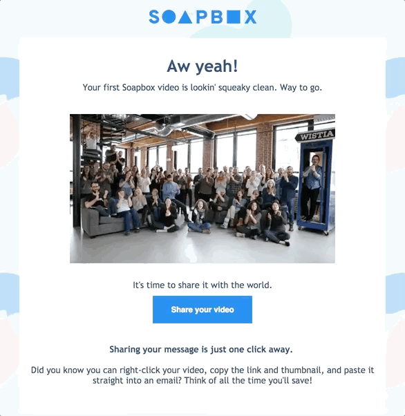
Soapbox, a Chrome extension that allows you to record and share videos, sends each new user an email (below) after they've recorded their first video. It's an opportunity to celebrate, as well as highlight a related feature: video sharing!
📖 Takeaway #3: Triggers & Custom Events
Rather than forcing users into a lengthy onboarding sequence (who has time to sit through 10 minutes of a wizard setup or product walkthrough?), break your onboarding into chunks. Use analytics 📊 and user research to identify the most common tasks in your product, and the behaviors that precede those tasks (e.g. clicking "Create"). These are your ⚠️ triggers. Then, consider what your users might need help with during this action and immediately after. Those steps can be turned into useful, relevant 💫 custom events. The result? Timely, helpful product education that feels tailored to your user's needs, as they need it.
Tip 4: Take advantage of empty states
Empty states are often one of the very last parts to be designed. Strange, when they're also likely to be one of the first things your user sees in-product!
Empty states describe areas in a user interface where there is no data to display. A few examples:
When all of the emails in your inbox have been cleaned out (wild, I know) 🤩
Searching for something on a website and getting no results 😞
Creating a new Google Drive folder that has no files yet 😯
In under-designed products, these screens often appear blank (or empty). This is a mistake— every empty state is an opportunity to educate and delight your user! 💖 A good empty state (particularly when users are trying your product for the first time) will tell users what the space is for, how to fill it up, and what they can do next. A great empty state will also inject an illustration, catchy slogan, or animation to further delight and connect. 😻
Dropbox, a file-sharing software, does this well with the following simple empty state, which shows users how to add their first file into their new folder.

Webflow, a web design tool, shows a similarly hilarious empty state to nudge users into taking the first step to creating their first website.

📖 Takeaway #4: Empty States
Empty states are one of the most valuable tools you can use to help onboard and educate your users in-context. They're the virtual equivalent of a hiking signpost ("Waterfall 0.2 miles ahead"). Designed thoughtfully, they help set expectations, inform users about what's possible, and nudge people into the right next step.
Learning & Inspiration
All primed up on onboarding? Here are some additional resources to continue your learning journey.
For product teams,
Inspired to redesign your onboarding, but not sure where to start? Katryna Balboni categorized over 500 user onboarding experiences into 8 distinct UI/UX patterns. No matter what product you're working on, these patterns will be your building blocks to a useful onboarding flow!

For product designers & PMs,
ReallyGoodUX is a curated list of, well, really.. good... UX! They've curated some great examples of product onboarding from across the tech industry. They're updated fairly often, so check them out for onboarding design inspiration.

For new empty state enthusiasts,
Shane Ketterman's article, "Empty States- The Most Overlooked Aspect of UX", dives deep into the different types of empty states, best practices for each, and clear examples. Whether you're designing or trying to convince a teammate of their importance, Ketterman's article will have you covered!
For even more inspiring examples, you can also check out Emptystate.es.
Let’s add it all up ⤵️
I cannot emphasize this enough: onboarding is critical. It doesn't matter if you're getting 1,000 or 1 million new sign ups each month if 77% are leaving within 3 days.
To give your product the biggest chance for success, it's crucial to give users the right tools and training to learn how to use your product correctly. This means getting rid of those static swipe-through screens and lengthy onboarding walkthroughs that are the same for every user.
Instead, think about designing your onboarding to be relevant, timely, and non-intrusive. This means:
Center your onboarding around "Jobs to be done": Understand what immediate tasks your user is trying to get done and help them get it done quickly.
Emphasize learning by doing: Get your users into your product as quickly as possible, and pair information with action, so that your users can apply what they learn in context.
Personalize the flow with triggers and custom events: Chunk your onboarding into smaller 1-2 step lessons that appear when a user is beginning to use a relevant feature. Keep your call-to-actions (CTAs) simple (one at a time) and don't be afraid to use email or other channels to accompany in-product learning.
Take advantage of empty states: Imbue the blank screens in your product with purpose. Use them to educate users about what an area is for, celebrate accomplishments, or tell people what to do next.
Like any type of learning or training, people need to thoughtfully guided and given the space to practice on their own. A thoughtful onboarding accommodates this style of learning more naturally, ultimately setting your users up to better understand, learn about, and fall in love with your amazing product. 💝

Liked this issue? Share the love 💞
Know other product folks, designers, or tech lovers that might enjoy this month’s topic? Send them this issue or share it on Facebook, Twitter, or LinkedIn.
And if you’d like to be reminded of upcoming issues, subscribe to get new issues straight to your inbox.
About the Writer
Lucy is a product manager, design nerd, and occasional blanket burrito. When not putting together newsletters, you can find her nose deep in a book or building apps for social impact.
If you’re curious about digital products, conversational design, or impactful technology, let’s connect on Twitter or email!