Issue 4: Illustration
The Delightfulness Project is a monthly newsletter exploring what makes products delightful. For future updates, subscribe here.
Hello, everyone! 👋
Lately, I've been noticing a trend among companies. Take a look— what do they have in common?
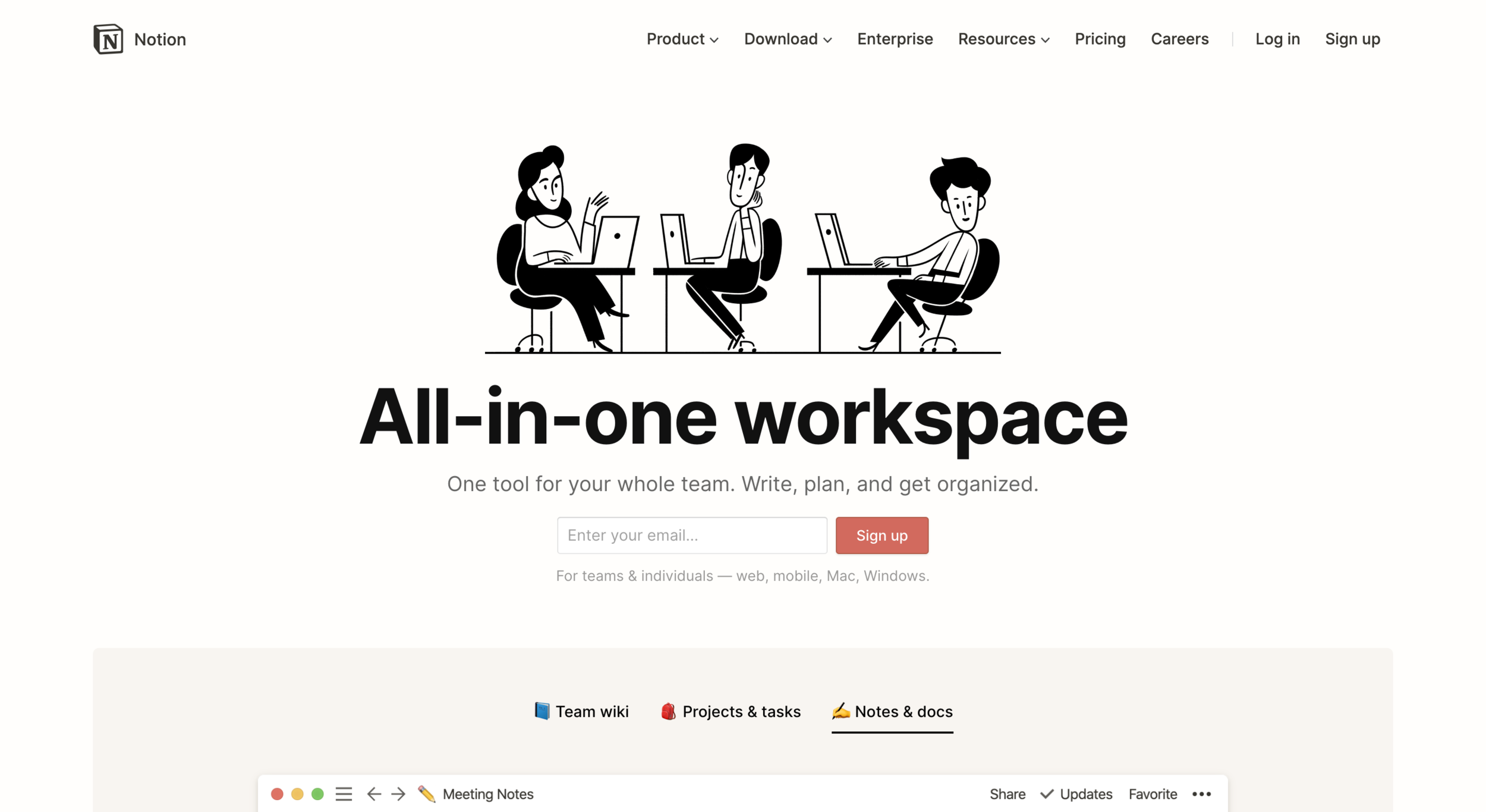

Despite the very different industries, all of these companies feature illustration as a key part of their brand. It's not just their websites; it's in their apps, too. ⤵️


And notice— when illustration is used in products, it's not just about the aesthetic. It's about function. It's about communicating.
Illustrations are powerful tools because of how effective they are in conveying dense, complex ideas simply. The right illustration can help to explain your product, forge human connection, and distinguish your brand. 💪
In This Issue

Principles of product illustration and how to apply it to your work.

A curated list of talented illustrators to work with on your next project.

Articles & resources so you can keep learning about illustration.
Animations courtesy of Julie Smith Schneider
Why Illustration?
Understanding product illustration and how to use it well. 👀
Product illustration is style of illustration that integrates aesthetic with function. It's about applying visual imagery for three main purposes:
Communicating ideas 💬
Reinforcing accompanying content 📄
Inspiring emotion 💛
Let's look at a few examples:
Communicating Ideas 💬
You often see illustrations in user onboarding, typically alongside text that describes what the app you’ve just downloaded does. These illustrations usually provide a quick visual way to communicate the main idea of the product.
A wonderful example of this is Endel, a stunning app that provides beautiful visual animations 🖼️ and soundscapes to help you focus. In its first onboarding page, this simple image perfectly illustrates the app’s promise to “Make the most of your day”. 🕓

Reinforcing Content 📄
Illustration can be immensely helpful to users when: (1) accompanying text is hard to read and understand or (2) when users need to know what to do next.
Foe example, Robinhood’s onboarding flow shows a gift of 💵 money 💵 to encourage users to sign up. Additional text, which describes the terms of the reward, is displayed beneath. Without an illustration, this screen would be too text-dense; with the image, it becomes tempts users to stay and read along. 👀

Inspiring Emotion 💛
Delightful products are inherently emotional. When a user has reached a goal and you want to congratulate them or when a user is confused 😕 or frustrated 😤, illustrations have the power to reach out through the screen and connect emotionally.
Mailchimp’s classic illustration, which appear immediately before sending an email campaign, is a perfect example of this. The sweating hand and the big red button are a kind and delightful way of acknowledging a user’s anxiety. “See?” The illustration seems to say, “We get it; this can be scary!” 😬

What makes good product illustration? 🤔
So what separates product illustration from good and bad? It boils down to 3 principles:
1. Be useful 👍🏽
If your team plans on applying illustration purely for aesthetic, then you're already starting on the wrong foot. Meg Robichaud of Shopify says this about illustration:
“Illustration provides context, adds clarify, or leads the user to their next step. Instead of matching your illustration to a word, match it to an idea.
”
Often, product illustrations embody this sentiment by using metaphors to explain complex ideas. The iOS app from Hostelworld best illustrates this concept.

⤷ Image from MarvelApp Blog
On the left, illustration is used purely as a background. Rather than reinforcing the text, the background distracts. On the right, an example of illustration used more thoughtfully. Though not a direct depiction of a trip, the cartoon calendar peeking through a telescope provides a fun and silly metaphor to reinforce the idea of "No future bookings". 😉
2. Consider Context 💭
The purpose of illustration is to communicate and connect. This means considering its context: who are your users and how will they be using your product? 👩🏽💻
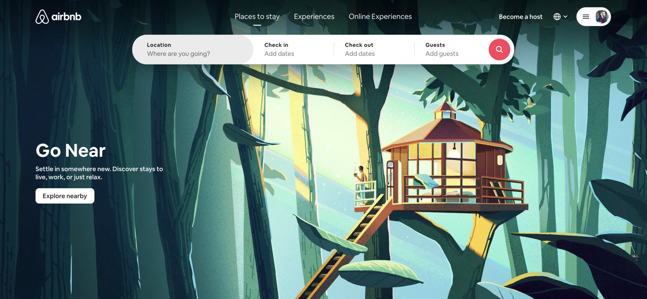
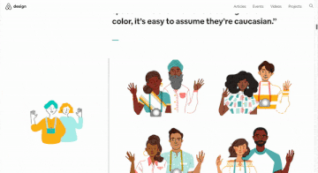
Consider Airbnb, a global platform for people to provide and find accommodations. 🏠 In 2018, Jennifer Hom of Airbnb wrote a well-known blogpost about how Airbnb rethought their illustrations to be more representative of their users. Hom says, "Words can set the tone for a company, but it’s the pictures that give it a face." In her work to define a more inclusive illustration style, Hom's guidelines aim to accurately represent all types of diversity: different races, ages, abilities, and body types.

⤷ From Airbnb: A host communicates with her guests through the Airbnb app
Another type of context has to do with emotional connection. 💞 Consider what your user might be feeling in any given step in your user flow. Are they happy ☺️, angry 😡, or confused? 😕 Depending on their emotional state, illustrations can help to empathize with people and humanize the experience.
3. Be consistent 💠
Particularly if you’re working with contracted illustrators or multiple designers, it’s important to make sure your images are consistent throughout your product.
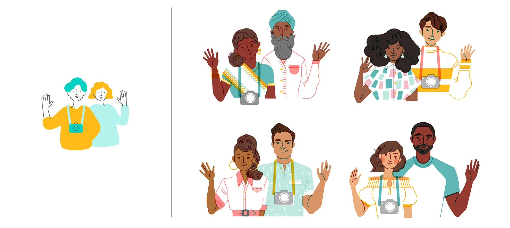
One easy technique is to limit the palette to a 2-3 colors, primarily if your illustrations are focused on objects 🚗 and environments. 🌍 (As shown in the Airbnb example, you should definitely use a wider range of colors if you are depicting a diverse group of people). Another approach is to make sure that all of your illustrations use the same perspective- that is, are they all flat and two-dimensional? Or if they’re 3D, make sure they’re all at the same angle.
Below are examples of Airbnb’s illustration style before 2018 and after.

⤷ From Airbnb: Different illustration styles used in the platform before 2018
⤷ From Airbnb: The transition from the old style (left) to the new (right)
Self-Check ✅
Think about your favorite products. Where are some places where illustrations might be useful? Are there any times where users might:
Need more guidance on what to do next?
Be getting bogged down in text?
Want to be congratulated or comforted?
Illustration are a powerful way to shift products from being purely functional to truly connecting with your users. If you’re thinking of infusing illustrations or any other type of visual imagery in your products, follow the above guidelines to make sure you’re using them well. Good luck! 🍀
The Illustration Shortlist
A curated list of talented illustrators to follow and work with. 💞
Inspired to use illustration in your products? Read on for a list of six truly talented illustrators that I admire and recommend working with! ❤️


Want even more illustrators?
Curious to find even more illustration talent? I recommend the following resources:
Black Illustrators: Editorial illustrators, cartoonists, animators and artists for hire.
Blacks Who Design: Highlights all of the inspiring Black designers in the industry.
Illustrator Hub: A directory of Black illustrators. Also features a great collection of Black illustration packs.
LatinXs Who Design: A living directory of thriving Latinxs in the design industry.
LatinX Design Directory: An open directory of Latina/Latino/Latinx designers and technologists, created by Zuli Segura.
Queer Design Club: An independent listing of queer-identified creators across industries and skill sets.
Women Who Draw: A self-described “open directory of female* illustrators”. Note: “Women Who Draw” is trans-inclusive and includes women, trans and gender non-conforming illustrators.
Got any other illustrator directories to share? Feel free to send them my way!
(I’d especially love to hear any suggestions for directories or communities of illustrators with disabilities!)
Learning & Inspiration
Articles, online communities, and other resources to learn more about product illustration.

For PMs and product designers,
A quick and informative read by product designer, Boriana Viljoen, on design principles to keep in mind when incorporating illustrations into your product.

For product illustrators,
Frances To, a product illustrator at First Circle, describes what product illustration is, guidelines, and tips for getting started.
For anyone passionate about design equity & inclusion,
Jennifer Hom’s case study on creating a more representative approach to illustrations at Airbnb is a must-read. Not only does she clearly lay out her process and various design explorations, but she also includes so many beautiful illustrations. It’s a true visual feast for your eyes!

For design system enthusiasts,
The “Atlassian Illustration Design System” lays out principles and guidelines for illustration in their internal style guide. Includes sample illustrations with do’s and don’ts.

⤷ Animation courtesy of Brandy
For bootstrappers & cost-conscious folks,
Don’t have a big budget to spend on custom illustrations just yet? Brandy’s guide to “Brand and Product Illustrations on a Budget” is just for you. From Blush to Open Doodles to Drawkit, there is a wide range of beautiful artwork that can be tailored exactly to your needs.
That’s a wrap, folks!
What’s that over-used phrase? A picture’s worth a thousand words? It’s true.

From the earliest cave paintings to now, illustrations have always been a permanent fixture of human communication. And now that you’ve finished this month’s issue, I hope that you can easily see why.
From a functional perspective, product illustrations are incredibly effective at communicating complex ideas and helping guide users through your product flow. More importantly, illustrations are wonderful ways to bring humanity, compassion, and connection into your user experience. They touch people at the core, elevating the experience into a higher order— reminding us what the world could be like, with just a bit of aspiration.
And I don’t know about you, but that sounds pretty damn delightful.
Share the Love 💞
Know some other designers or product enthusiasts that might enjoy this month’s topic? Send them this issue or share it on Facebook, Twitter, or LinkedIn.
And if you’d like to be reminded of upcoming issues, subscribe to get new issues straight to your inbox.
About the Writer
Lucy is a product manager, design nerd, and aspiring blanket burrito. When not putting together newsletters, you can find her redecorating her island in Animal Crossing or in the midst of mild existential crisis.
If you’re curious about digital products, conversational design, or impactful technology, let’s have a chat!